


Key Takeaways
- The Health Score becomes clearer than ever: Users now have a deeper understanding of their health data, empowering them to make informed decisions and take control of their well-being.
- Designing with inclusivity: Accessibility is a foundational right that is now part of our platform to ensure equal access for all.
- Making your health journey fun: Daily highlights on your health and a more intuitive content library keep users motivated and involved in their health journey.
- Configurability for every client: Modular components give clients the power to tailor the platform to their unique brand and user needs.
Strategic insights and priorities: Shaping the future of our platform
After conducting a thorough market analysis and gathering feedback from both users and clients, we laid out our strong points and our improvement areas. Based on this analysis, we’ve outlined priorities.
- Health Score transparency is a major user demand: Many users are eager to understand how their Health Score is calculated and how their actions affect their results. On a similar note, they want to understand what their score translates to in day-to-day life and what it means for their health.
- Accessibility compliance is no longer optional, it’s essential. The European Commission has released the Directive 2019/882 and the ADA (Americans with Disabilities Act) has included Web and Mobile Accessibility in their regulations, hence we’ve audited our platforms and are actively taking the necessary steps to make sure our product is compliant with the regulations. For a more in-depth analysis about how we tackled it, read our detailed article about accessibility.
- Re-imagining fun and engaging ways to deliver health information to end-users is crucial in a crowded marketplace of health apps.
- Clients want more control and brand flexibility. Having more configurability options has always been one of our priorities, and our clients agree! We have taken a few extra steps to ensure we bring new possibilities to make each platform unique.
Based on all these factors, we went back to the drawing board and outlined possible improvements.
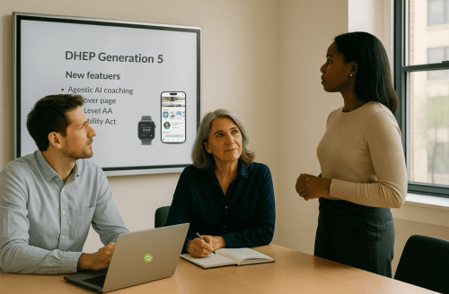
After several rounds of feedback, engineering analysis and user-testing, these are a few of the main updates of Generation 5.
Demystifying the Health Score: More insights, better guidance
The Health Score is the core of dacadoo, so it is of the utmost importance that our end-users understand how their lifestyle choices affect their overall score and how important it is to keep their information up to date.
Users can now clearly see how their lifestyle choices impact their Health Score, week by week and at a glance, empowering them to adjust, reinforce healthy habits and stay on top of their health.
We’ve introduced a new Health Score access card featuring a trend tag that shows users how their score is evolving compared to the previous week. We designed the card to emphasize the user’s overall health trend and category (e.g., ‘Very Good’) rather than focusing solely on the number itself.
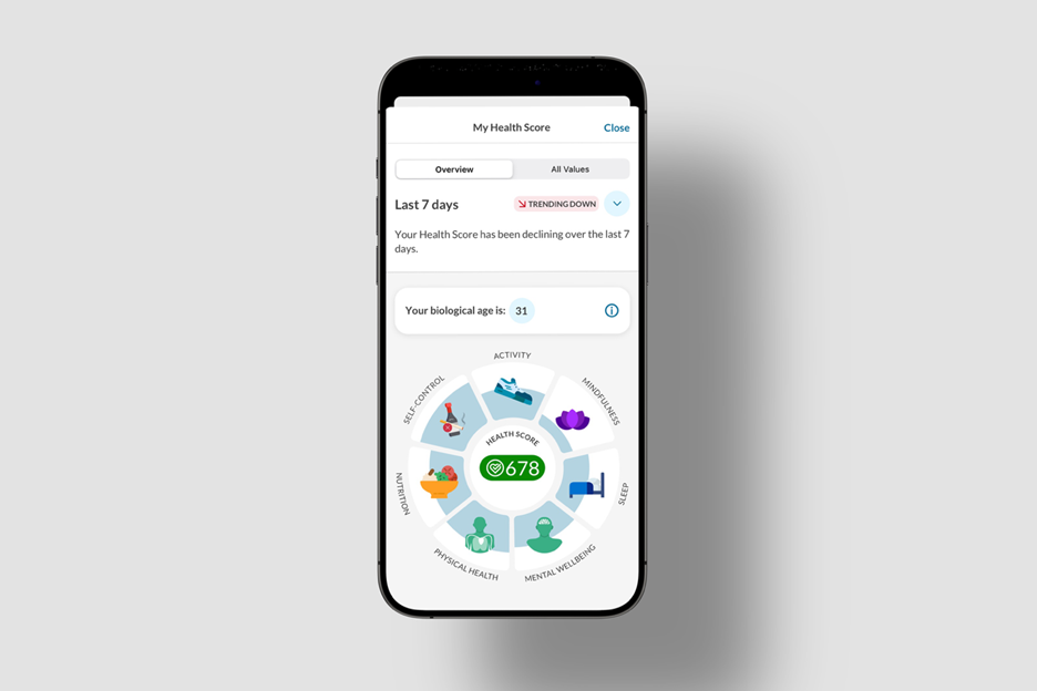
Image 2 – A Health Score Wheel showing a score of 678 (very good), with a correspondent biological age of 31 years old and a downward trend over the past 7 days. There are categories like activity, mindfulness, sleep, mental wellbeing, physical health, nutrition, and self-control.
When diving deeper, the user gets in-depth details about their score evolution over time with the ability to filter their timeline daily, weekly or monthly.
Simultaneously, we’re now introducing the Biological Age a new metric that adds meaningful context to the Health Score, helping users understand better how their health impacts longevity.

Image 3: A series of cards showing several lifestyle categories, some with lower scores than others. The ones with lower scores show a call to action to start improving them. They all show an explanation of what they calculate and access to keep them updated.
Curious users can now access clearer explanations about how each lifestyle area is assessed, and how to keep each section up to date.
One of the most exciting features in Generation 5 is the Health Score Potential! It’s a guidance to the Health Score that helps users understand what actions to take and how much impact those actions have on their Health Score over time.
Our engine identifies each user’s weakest areas, highlights them, and recommends specific healthy habits (Goals) that are most likely to have the highest impact on the user’s Health Score.
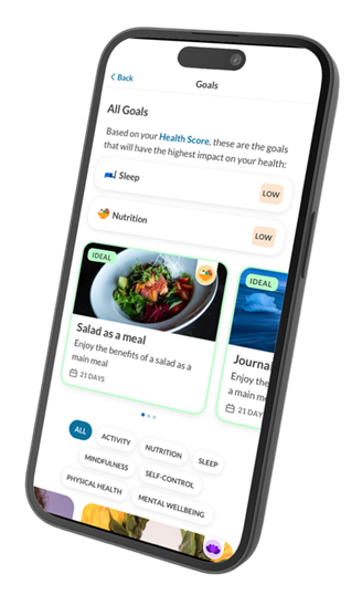
Image 4 – Health goals overview showing Sleep and Nutrition as high-impact areas. Suggested goals include “Salad as a meal” with a 21-day duration to improve nutrition.
Building Digital Experiences for Everyone
Inclusive design is essential. Both EU and US regulations now mandate accessibility for web and mobile platforms, emphasizing the importance of ensuring that digital products are usable by all individuals, including those with disabilities.
As we continue improving our products, we’ve made accessibility compliance a core requirement. Through comprehensive audits, WCAG criteria are now integrated into our development standards.
Improving one’s health should be accessible to everyone.
To learn more about how we tackled this subject, read our dedicated article on Why Accessibility Matters.
Making health fun and engaging
Health data can be hard to interpret. Some days you work out more, some days you sleep worse, it’s hard to keep track of all these variables and determine the right next steps, especially if you don’t have much time to do your own analysis.
That’s why we are introducing Highlights!
In a similar fashion to Instagram Stories, Highlights deliver the most relevant content to the user on a timely basis. Examples include healthy habits tips, summaries of their weekly and monthly activities, steps and sleep stats, earned achievements, and more.
Even better, clients can create their own Highlights using a set of templates and customize them to match their brand.

Image 5 – Highlights section with categories for Latest Workout, Achievements, Goals, and a Weekly Report.
Building a new content library and optimizing the architecture
When it comes to finding new content, it is now easier than ever. Users can explore our options in the new Discover Page. From Goals, Challenges, Events, Articles and more, everything is now available under one single page, creating an overview of all our available content which allows end-users to find what they’re looking for faster.
This allowed us to re-arrange the platform’s architecture to become more intuitive, solidifying the purpose behind each page.
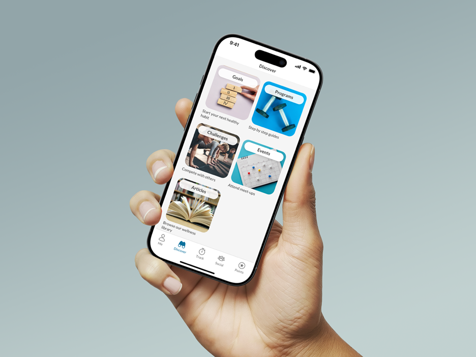
Image 6 – Discover section with tiles for Goals, Programs, Challenges, Events and Articles. Each tile represents a feature like forming habits, joining routines, competing, attending events and reading.
With this library, clients can change the image, titles and order of every tile as well as add new ones to promote products and campaigns in-app or external resources!
Introducing New Configuration Features
We’ve introduced a series of configurability options aimed at giving clients more control over how their product experience is shaped and delivered.
These changes reflect a future-proof design for configurability, enabling teams to create flows and interfaces that feel purposeful, aligned with brand identity, and responsive to user needs, with faster delivery, and easier self-management .
From layout flexibility to modular content structures, the platform now supports a wider range of design decisions without sacrificing coherence or usability. Clients can fine-tune the order information displayed, if displayed at all, change visuals, sections and more.

Image 7 – Three examples of the same page, displaying different placements of the same sections alongside different color schemes and imagery.
The result is a more expressive, design-forward platform that balances structure with creative freedom, making it easier for clients to deliver experiences that are not only functional, but truly engaging by design.
How did we make these decisions?
dacadoo follows processes like those performed by major tech companies. This approach ensures that awareness and user research are seamlessly integrated at every stage of the development process.
We start by interviewing and gathering feedback from end-users and clients to understand their needs, followed by forming hypotheses on what should be improved. We then design new experiences that improve on previous feedback. After extensive testing, development kicks off. This is a continuous, iterative process that allows our products to evolve and stay aligned with real user expectations.
Closing Notes
These updates represent a fundamental evolution in how we approach product design, user engagement, and long-term platform growth. By combining thorough research, regulatory awareness, and continuous feedback loops, we’ve been able to bring meaningful change to the user experience while also empowering our clients with greater creative freedom and control. Whether it’s making health data more intuitive, enhancing accessibility, or enabling flexible configurations, our goal is to ensure that every interaction on the platform feels thoughtful, inclusive, and purpose-driven.
As we look ahead, we remain committed to building a digital health experience that evolves with our users, one that is dynamic, personalized, and designed to support healthier lives every day.
To learn more about how to integrate these features into your organization, contact us.